
This blog is the second in a series, read the first blog in the series.
In my first blog I used the Cynefin framework as a useful tool to use when considering how and when to focus on data in a crisis. Establishing which of the four domains you find yourself in can be useful when gathering and implementing data.
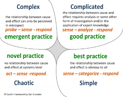
It’s only when you aren’t in a crisis that data visualisation adds value; when you’re able to leave the Chaotic domain and people can lift their heads up from the crisis at hand.
Be warned! It’s only with the gift of hindsight and the 58 slide presentation that someone worked on for 4 weeks, showing patterns and trends that shows people in the crisis could have made better decisions. Useful information at the time of crisis that can help improve understanding on whether what’s happening is what’s needed.
While people deal with the crisis, someone in the background can be working on the data in preparedness for when they enter the space between Chaotic and Complex. Key to this, is ensuring a two-way stream of communication of the activities to avoid ending up with data that doesn’t reflect the ‘work as done’ – instead reflecting the ‘work as idealised’.
Creating this space where people can come together and make sense of the data (which may look different for each domain) is where improvement professionals with data knowledge can come in.
Strategising with Complex data
Start by asking yourself: do I have time to look at data? If you can go back to the first blog to check the definition – you have time. If you can just about keep your head above water, you are probably in a strategic space; somewhere between Complex and Chaotic. You have just enough time to make sense of what is going on and respond without much analysis. This is an exploratory phase where it’s ok to use ‘dirty data’ (potentially inaccurate or incomplete), leading to emergent practice which can be built upon.
When you find you have a little more time, beware of those saying they need more data before making a decision. This leads to analysis paralysis. Is the data good enough to help inform you that you are heading to where you want to be? It can be helpful to remind people that an act of omission is often worse than working with the ‘dirty data’ available to them.
In this instance, suggest a simulation exercise; using real world data can enhance our understanding on the effects of decision making and then re-inform your strategy for using data required for moving forward. A great example of this is the modelling exercise used to develop the Welsh Access Model, facilitated by the EDQDF lead nurse, Anna Sussex. DARPA, Harvard and the military all create tactical exercises to test their ability to aid in ‘plan-as-you-go’ during complex situations. Malcolm Gladwell’s book, Blink, goes into more detail on this in chapter four if you want to learn more.
Complicated data
You’ve got a bit of time to deliberate. You want to have someone else do the analysis and then think about what the next move is. If possible, get a good data analyst who asks lots of questions. If they don’t speak to you often and just process data, it’s likely that no context has been applied and little sensemaking. Make sure to ‘FUPS’ the data with them; to what extent is it Flawed, Uncertain, Proximate or Sparse? (Yes, it’s a thing – I will explore this in a later blog).
Chucking data in a pivot table on excel is not analysis; knowing the limitations is vital. Clever data visualisation is nice but if no one can read it to understand – it’s just showing off. If you’re in the Complicated domain, make the most of the time at hand and hit them between the eyes!
Data that should be simple!
So how do we know that a change in the data demonstrates improvement? Or if a change didn’t impact the data, how can we understand why?
Though similar, these questions are not to be confused with the NHS model for improvement question: “How will we know a change is an improvement and what change can we make that will result in an improvement?”.
If you have been in a crisis or a strategic space you usually made the improvement(s) during that phase and are now looking for the evidence in the data after the fact. Retrospective coherence can creep in here as you are subject to 180 odd human bias’ and fail to account how decisions were made what changes were implemented.
The model for improvement can be used in the Complicated domain when there is time to plan, do and study (a PDSA cycle). In the Chaotic and Complex domains, there can be no static planning, as real-time adaption is required and any ‘performance’ data is viewed in hindsight.
The initial conditions of the NHS model for improvement also assume that there is a relationship between cause and effect, which would place you in the Simple domain – which is not an insult. Making sense of the data and responding brings about best practice. Data that is presented clearly should make decision-making simpler; providing clarity that it’s the right thing to do. Just be careful it wasn’t a ‘just do it’ in the first place. Don’t make an improvement project out of a permission decision.
Data that is presented clearly should make decision-making simpler; providing clarity that it’s the right thing to do.
So, is there a strong connection of cause and effect? In the context of data gathered from the pandemic, is it a closed system like a lab or another highly controlled area like a theatre? If the answer is yes, your data sits in the Simple domain and not only will it show that your improvements have worked, they will coincide with the dates you did the PDSA cycles. It’s a thing of beauty; catnip to improvement professionals.
Let’s reflect on this a moment: high cause and effect closed system and controlled environments leading to changes coinciding with the PDSA cycles. This may not sound like your working environment. There is a reason some approaches do not work in open systems in unscheduled care (USC), such as Emergency Departments. Managing processes within the management of USC can be challenging, but ask yourself – ‘is the thing I’m trying to count a process? Or an activity (with multiple processes)?’. Measuring and counting are different things, as much as processes and activities are.
If you have a sense of where your data sits in the domains, the next blog will explore how you can review it, understand its limitations and whether you can expect to see a change based on it.