
What do you get if you cross a mathematician, some improvers and a couple of psychologists?
Is this some kind of joke?
Nope, it’s an improvement project called Psychology 4 Improvement (P4I), which has brought together a range of people interested in change in health care. This blog is about how our logo has changed, in line with how our understanding has shifted – of the project, and of each other.
Here’s what we started with:
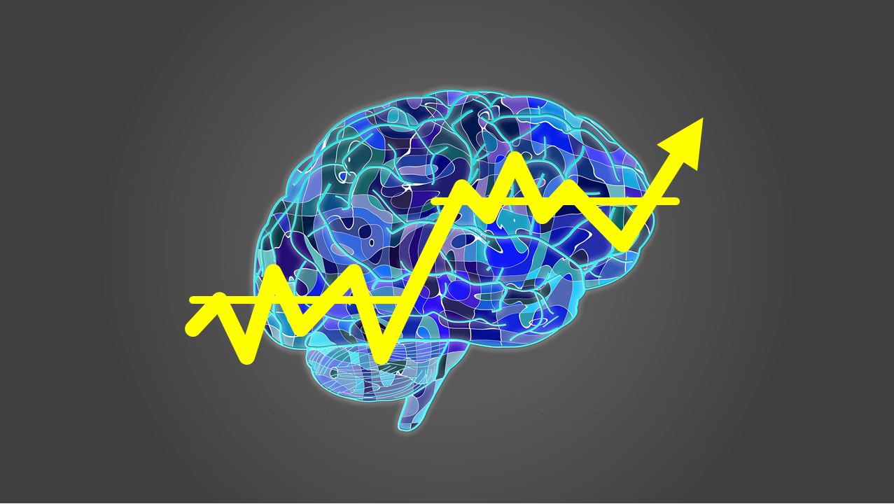
What do you see?
‘Psychology 4 Improvement? It’s all about brains, isn’t it? And run charts?’ Our early exchanges indicated that our work together would be something science-y, about experts and data. We’d see some linear progression from the beginning of the project through to some deliverables that we could measure at the end. Wouldn’t we? I remember early on in our steering group a feeling of anxiety about having to demonstrate my competence, maybe a pressure to make some clever comments, or use the right jargon.
Even though our starting point was a shared understanding of Marjorie Godfrey’s quote that “improvement in healthcare is 20% technical and 80% human”, we in fact started with something that felt far more technical. Perhaps this is the play-it-safe, risk-averse culture we are immersed in, and it becomes the default place to start?
Perhaps this is the play-it-safe, risk-averse culture we are immersed in, and it becomes the default place to start?
Even early on, questions were sometimes raised about the logo; is it quite right? Is it a bit too individual rather than relational? But there was tentativeness – it felt best not to risk hurting anyone’s feelings, better not say anything that might be too contentious. After all, we were all involved over-and-above our day jobs, and someone has taken the time to design this, so let’s just go with it. Perhaps there wasn’t the psychological safety to talk about this, or perhaps an alternative logo wasn’t obvious as our work was forming.
We met every couple of months. There was a sense of our commitment to the project and each other despite the wider circumstances of the pandemic. There was something engaging and interesting about bringing together our differences. We supported each other in some ‘random coffee trial’ conversations, we found out more about each other, who we are, and what we’re going through. Steering group meetings became noticeably light and fun, and yet there was also a sense of really moving. I’m not sure words like ‘progressing’ or ‘being productive’ are quite right. It was more like a richness and depth forming – preparing some fertile soil to grow who knows what. We were enjoying not only working together but also each other’s company. We shared a Space for Listening, a sense of connection growing ever stronger as we shared and witnessed each other’s vulnerability.
In more recent months, we have noticed a sense of belonging, a feeling of being able to say what we want – a warm, relational process, and a confidence that we can turn up and be ourselves and that we each have something to offer. We have reflected on our close relationships, and our collective strength as more than the sum of our individual parts. We are more than our individual brains, and the process together has not felt linear.
We wonder if this process we have experienced might reflect the wider journey the improvement community might need to embark or continue on. Bringing an understanding of psychology into improvement, realising that the work of improvement needs to be relational if it is to succeed is a key part of our group’s work.
So, we decided to develop a new logo. A small number from the group created some options, and then we all fed back our thoughts. Here are the options we looked at:
![]()
What was noticeable was the quality of the conversation we were able to have about these images. It felt like an important conversation and also one that embodied a combination of fun, inclusion, creativity, and freedom to express an honest opinion.
And here’s the final cut.
![]()
It has a combination of clean lines, and is also about people, shades of soft colours, space for discovery and story. There are still brains in there, but they are implied. We wanted something to represent us, and also our purpose; bringing together our rich diversity enabling us to work towards sharing and developing understanding. So we feel more legitimate now in using Godfrey’s quote “20% technical and 80% human”. We’d want to add to this quote that to us, the ‘human’ bit is about relationships, connecting in our shared passions, and valuing our differences –the multiple shades and colours we each bring.
Interested in finding out more about the project? Visit the team’s project page or read their latest update blog.