
We are piloting a new approach to social network analysis to take our understanding of Q members and the connections between them to the next level. To do this, we’re using Sumapp and Kumu software. And crucially, we are aiming to both systematically measure and better facilitate connections between members by:
- Supporting individual map members to build connections and collaborate. The pilot maps allow members to identify those with shared interests or complimentary skills and then use the profile information to make contact and work together. (We hope this will build on what we offer through our existing Member Directory, and help us learn how we may develop that.)
- Assessing the strengths (and weaknesses) of the network. The pilot maps allow for detailed analysis on the nature and number of connections. As well as helping evaluation, this understanding supports network leaders to identify key players, pinpoint flourishing hubs and find areas that need further support to develop.
The pilot approach
This year we are undertaking pilots with three sub-networks within Q. We are working with partners to co-design the map content and to test the uptake, use and value of this approach to mapping. We want the pilots to be valuable in themselves, but we also have one eye on the potential of a future Q-wide social network map.
The maps are made up of two building blocks:
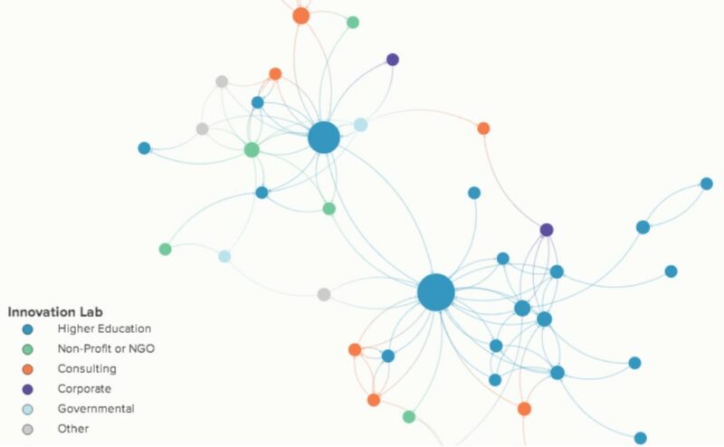
- Member profiles: their role, background, skills, interests, assets, and most importantly, contact information
- Connection data: detailing exactly how map members have connected with other individuals.
Members can filter this information to present the map in the most meaningful way for their purposes.
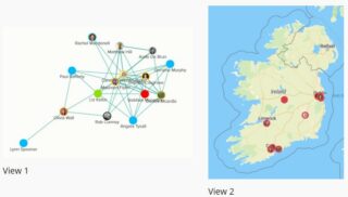
The three pilot maps are:
- The Network Weaver map (running from March 2021 – August 2021). Exclusively for the 36 full-series participants, this tracked and supported collaborations across the cohort.
- Allied Health Professionals in Quality Improvement map (launched July 2021). In partnership with Q’s AHP in QI network, this focuses on the skills and experience that network members are looking for support with and can offer to others.
- Q community Ireland map (launching September 2021). In partnership with the Health Services Executive, this maps the interests of those involved in health care quality improvement in Ireland. If you’re based in Ireland, join the map ahead of its wider launch.
What have we learnt?
The pilots are just getting started but thanks to the commitment and pioneering spirit of partners, we have already learnt a lot. If you’re considering mapping too – here are four things we recommend you consider:
- Invest time in co-design
Involving map users in shaping map content has boosted engagement for us. We found that map co-design was more meaningful after some light-touch training. - Follow good data protection practice
Partners and users flagged concerns on this throughout co-design. Rigorous processes and consent protocols are important, as is communicating these well to reduce any concerns. At the Health Foundation, we have formally reviewed and approved the privacy and data policies of Sumapp and Kumu. - Embed the map in existing activities as much as possible
Participation in the map needs to be regularly promoted through communications, including through network champions and by building it into events. We achieved this to some extent through the Network Weaving series but our experience suggests even more of this is necessary to drive high engagement. - Accept the limitations of the software
Sumapp and Kumu offer a brilliant live, searchable map with built-in metrics. Yet, they have particular limits around survey functionality and the flexibility of map visualisation for different user needs. Plus, they don’t wholly overcome the age-old challenge of encouraging people to enter and update their data.
Resources and next steps
Word got out fast! We have been inundated with requests for more information and support for applying network mapping to Q Special Interest Groups, regional networks and beyond. So, if you want to learn more or give it a go yourself here are some resources you might find helpful and some ways to keep in touch:
- This Social Network Analysis Toolkit will help you get started
- A Guide to Network Mapping in Kumu takes you through the steps
- Join Q’s Network Mapping special interest group for regular updates, shared resources and questions – only interest and enthusiasm required
Once we have completed the pilots, we will share more learning with you. Keep an eye out early next year for updates.
Comments
Claire 30 May 2023
Hi There,
I am currently working in a community group in which we have thought about using kumu to map out our services. I was wondering if you could give me any further advice surrounding the strengths and limitations of this software and if you guys have moved out of the pilot stage.
Thanks!
Claire
Tif 30 Jun 2023
A stroke of luck led me to a website that opened the door to a world of stock vector graphics and images. It was a digital sanctuary that catered to my every visual need. The website's comprehensive collection encompassed a myriad of subjects, styles, and moods, allowing me to find the perfect visuals to suit any project. From sleek map pin vector and modern designs that exuded professionalism to whimsical and playful illustrations that added a touch of charm, the website became an invaluable resource in my creative toolbox.